

Content Creators, including marketers, designers, copywriters, bloggers, influencers and, in today’s age - any person with a social media account - rule the world. As clearly displayed through worldwide awakenings, policy changes, and culture shifts that media movements such as #BlackLivesMatter and #MeToo created; content, and the language used to create the content, fabricate the nation’s conversations. There has never been a more important time for content creators to reflect on their own, inherent biases and to ensure their communications are inclusive and respectful for all.
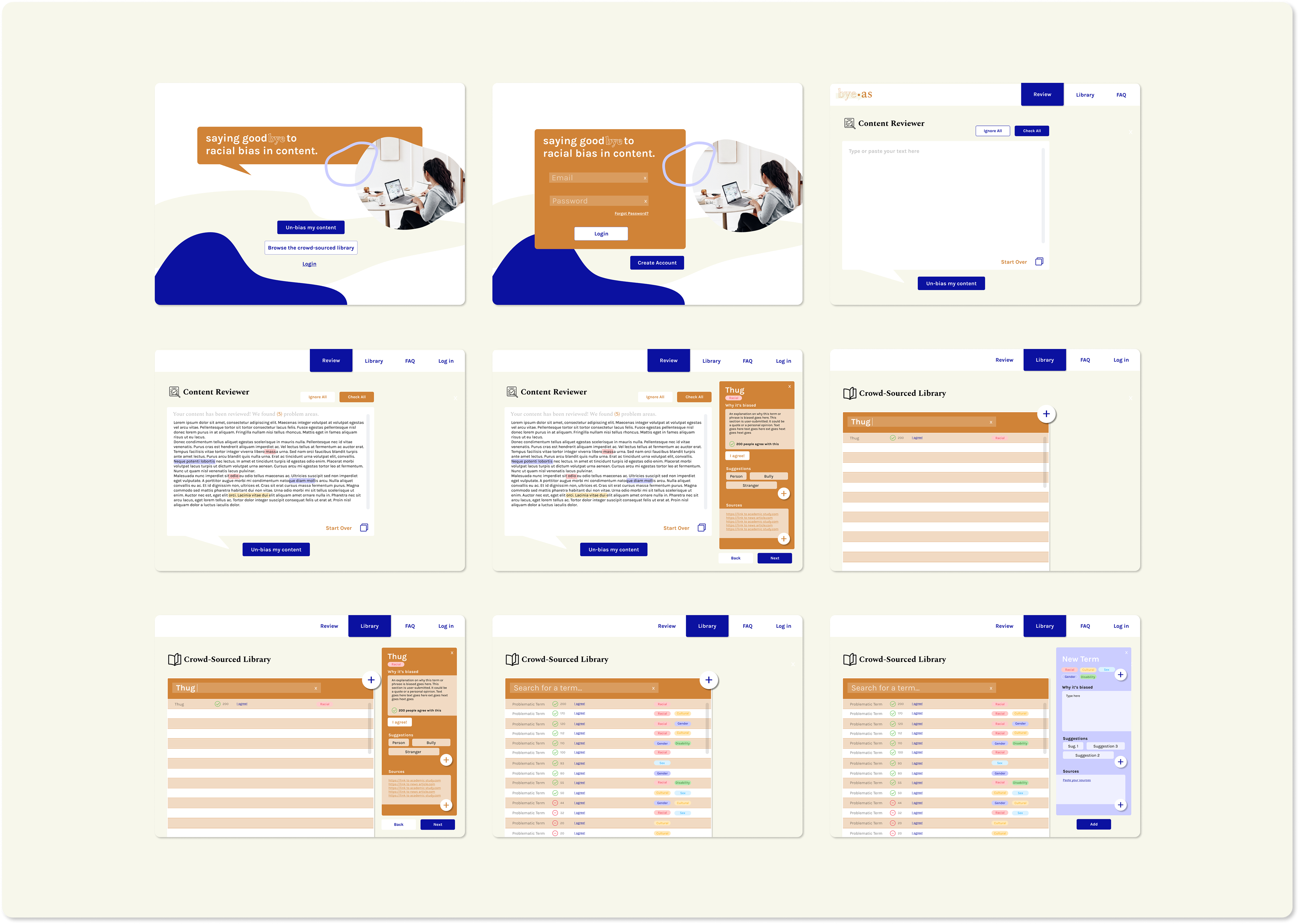
Bye-as is a web platform that allows Creators to submit their content for a racial-bias review. Creators receive suggestions and feedback on its biased terms and problematic areas. To do so, Bye-As maintains an ever-evolving library of terms, phrases, and suggestions that are submitted and "agreed upon" by users.
I conducted all research, surveys, designs, and analyses for Bye-as through the User Experience Nanodegree Program with Udacity. Find my entire process below.
Disclaimer: This project is still in the process of being designed and developed.
REVIEW YOUR CONTENT FOR BIAS
BROWSE OR ADD TO THE CROWD-SOURCED LIBRARY
_______________________________
THE PROCESS
1. Project Scoping / Competitive Analysis
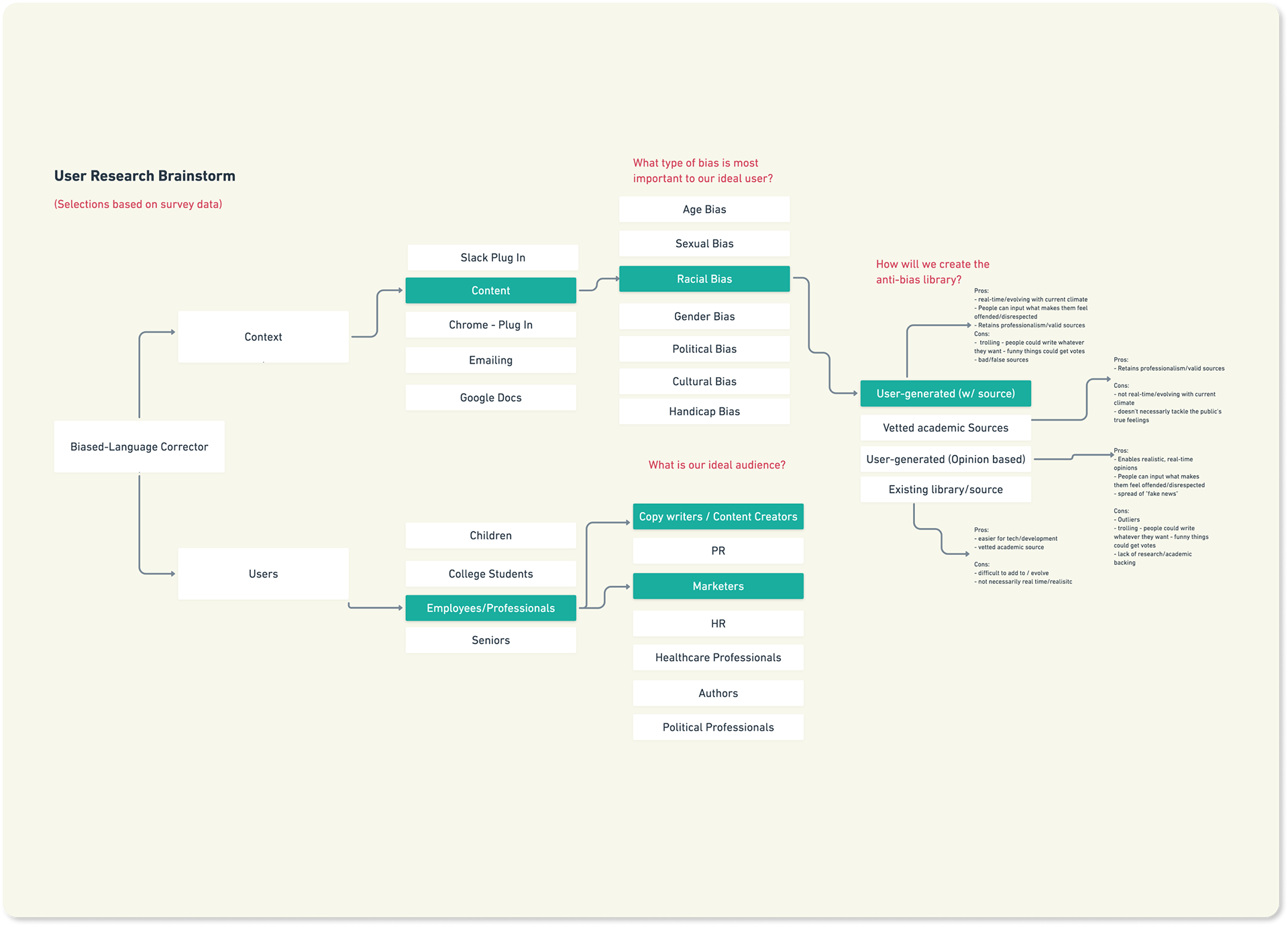
First, I brainstormed all of my assumptions and ideas for a design solution in a flow chart.
I. Academic Research
I conducted academic research to determine if my assumption [Language bias is a prevalent problem in content] was valid.
II. Competitive Analysis
Next, I researched existing bias-checking software and platforms. I quickly learned that that were many platforms being used for HR communications. I also learned that gender bias was the most common detection. For this reason, I chose to target content creators instead.
2. User Research
The two main goals of the studies were: 1. Determine if our target user (content creators) would use technology to review content and 2. Determine whether or not they believed bias was important. View my full plan here.
Study 1: Semi-Structured Interview
Research Goal: Would users utilize technology to review their content?
Study 2: Survey
Research Goal: Is bias important to users?
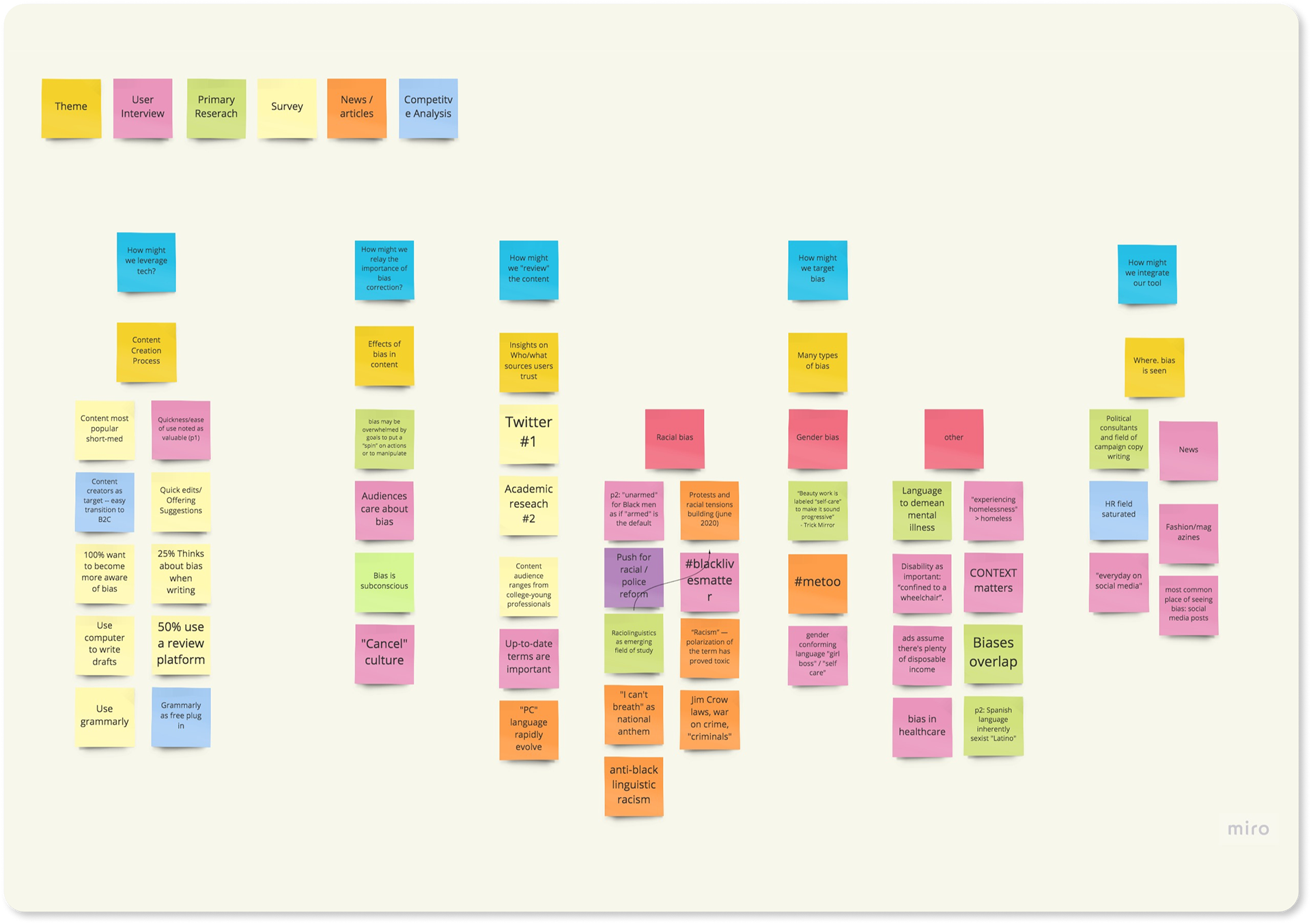
3. Research Synthesis - Affinity Mapping
I synthesized all insights collected from the study, interviews, primary research, and the competitive analysis. Then, I created an Affinity Map by finding similarities between notes and grouping them into themes.
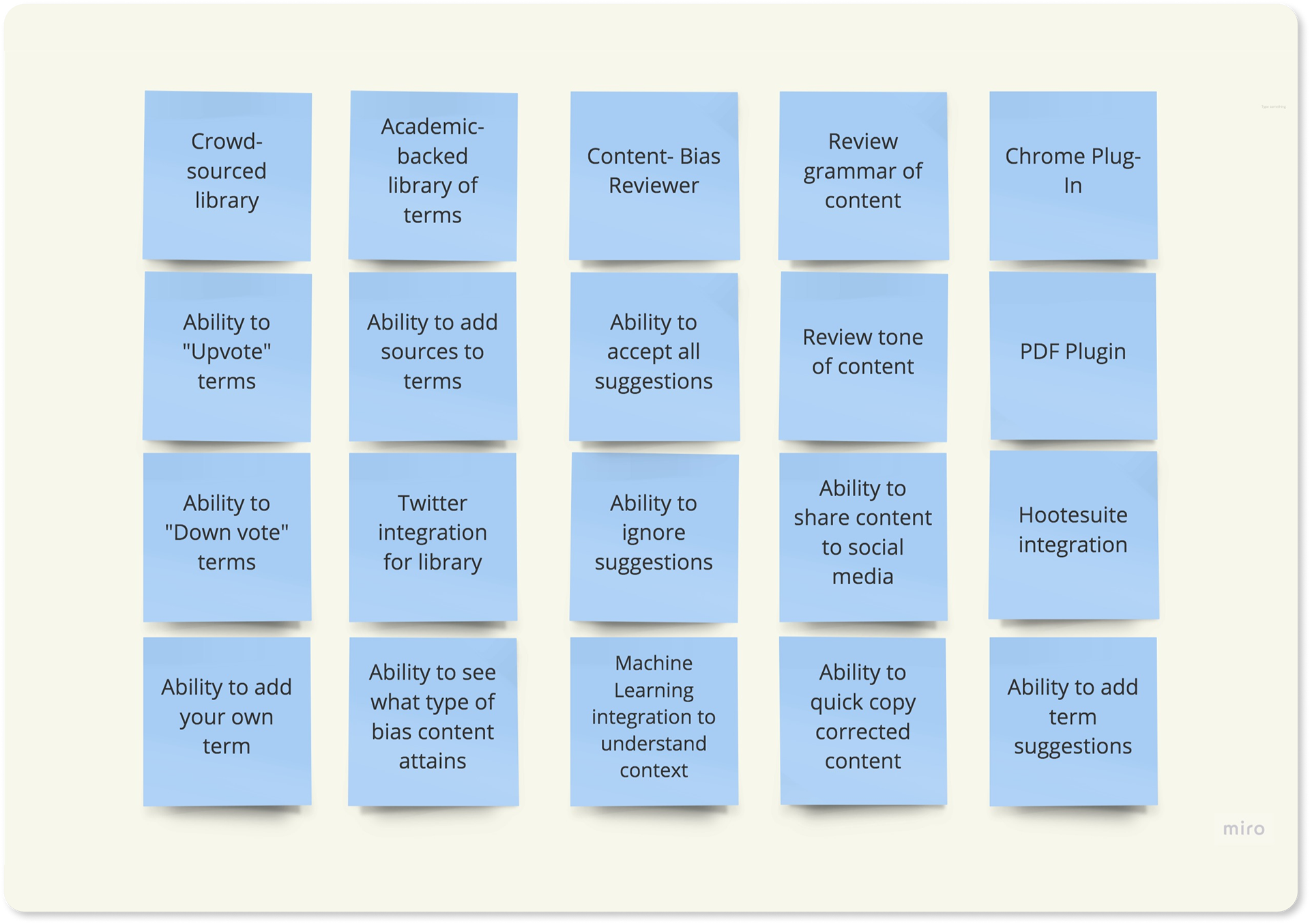
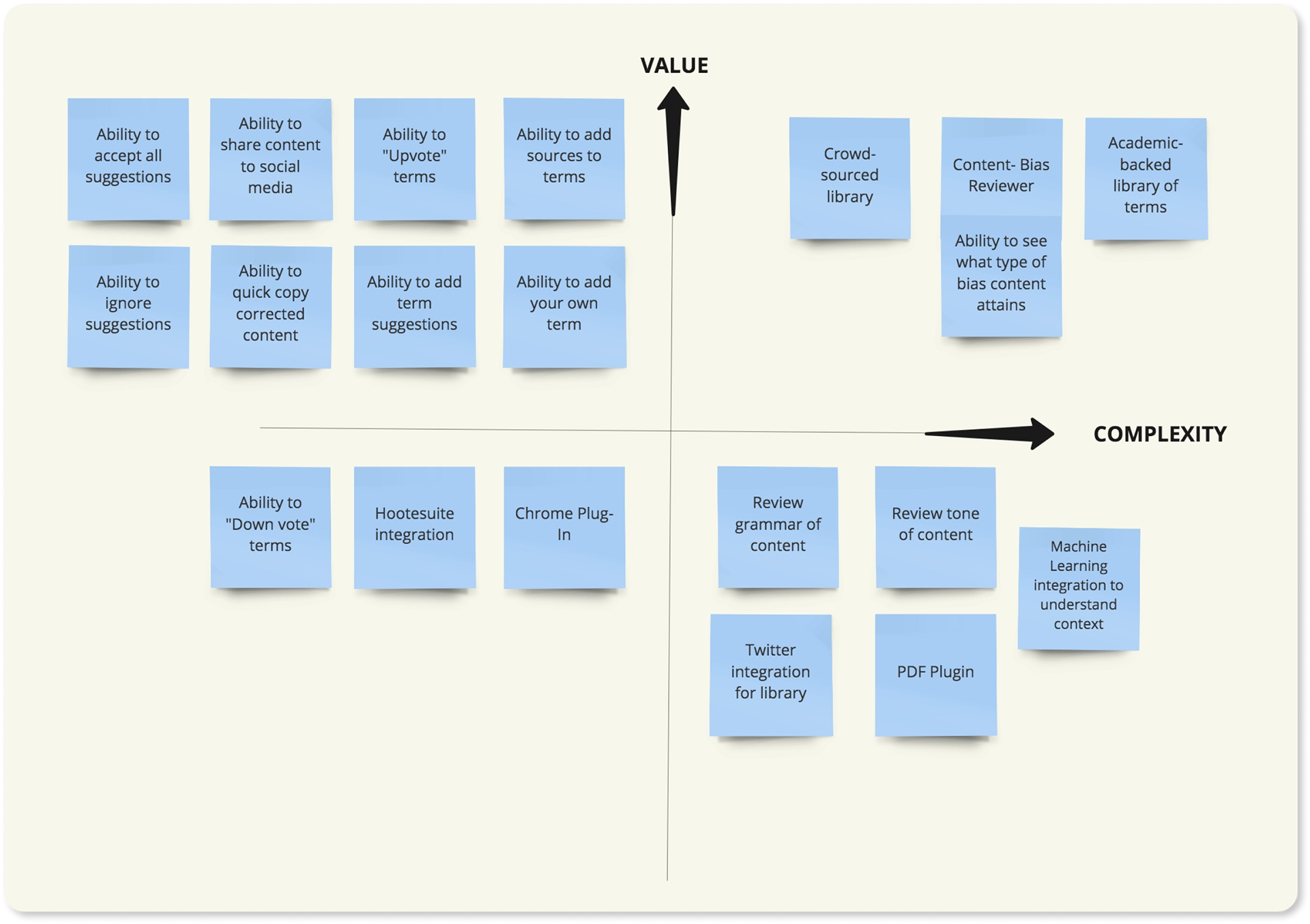
4. Research Synthesis - Feature Prioritization
Next, I brainstormed different app features and made a Value-Complexity matrix to determine which features should be prioritized in v1.
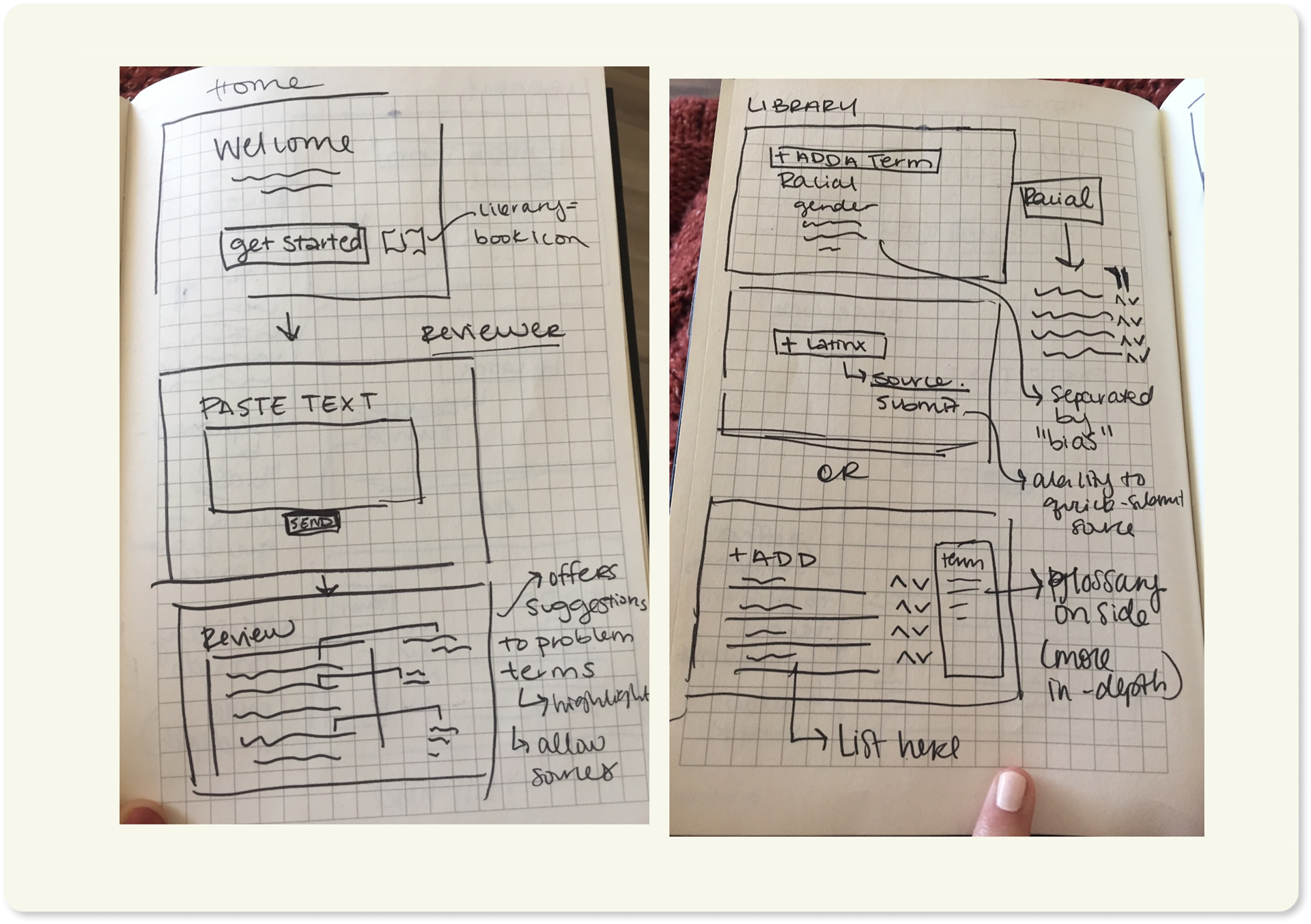
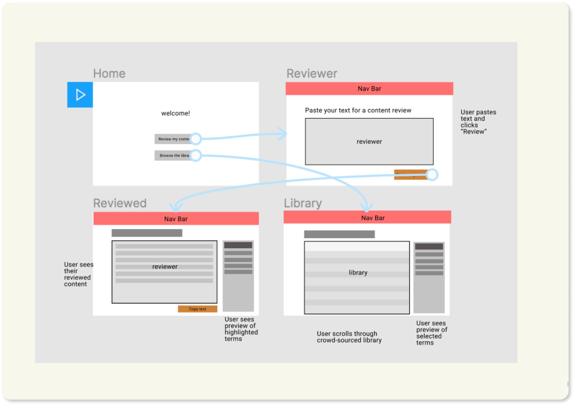
5. Sketching and Super Lo-Fi Mockup
I started the design by sketching ideas for the app on paper. Using that, I created a super low-fidelity mockup to display where content would appear on the pages.
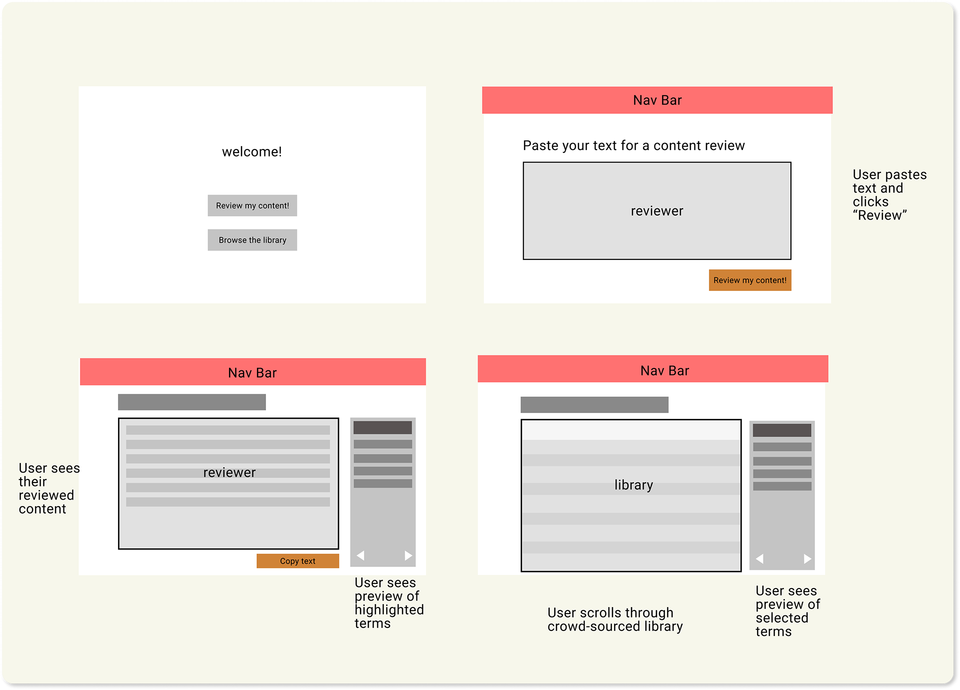
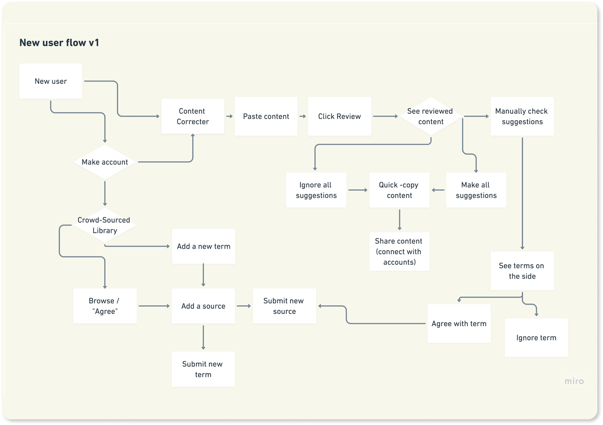
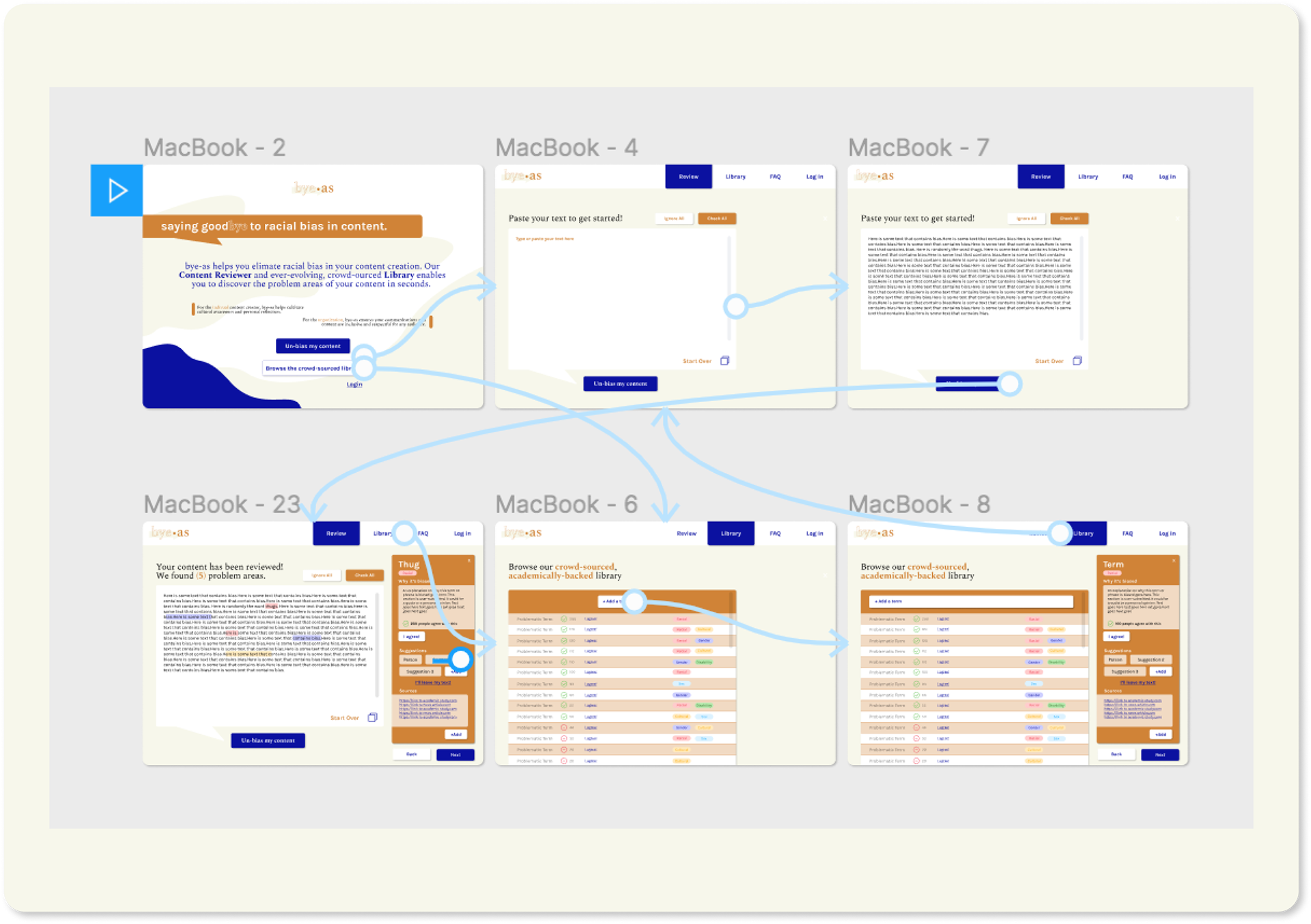
6. User Flow and Rapid Prototyping
Next, I brainstormed all possible user flows and quickly prototyped the most likely flow with my low-fi mockup.
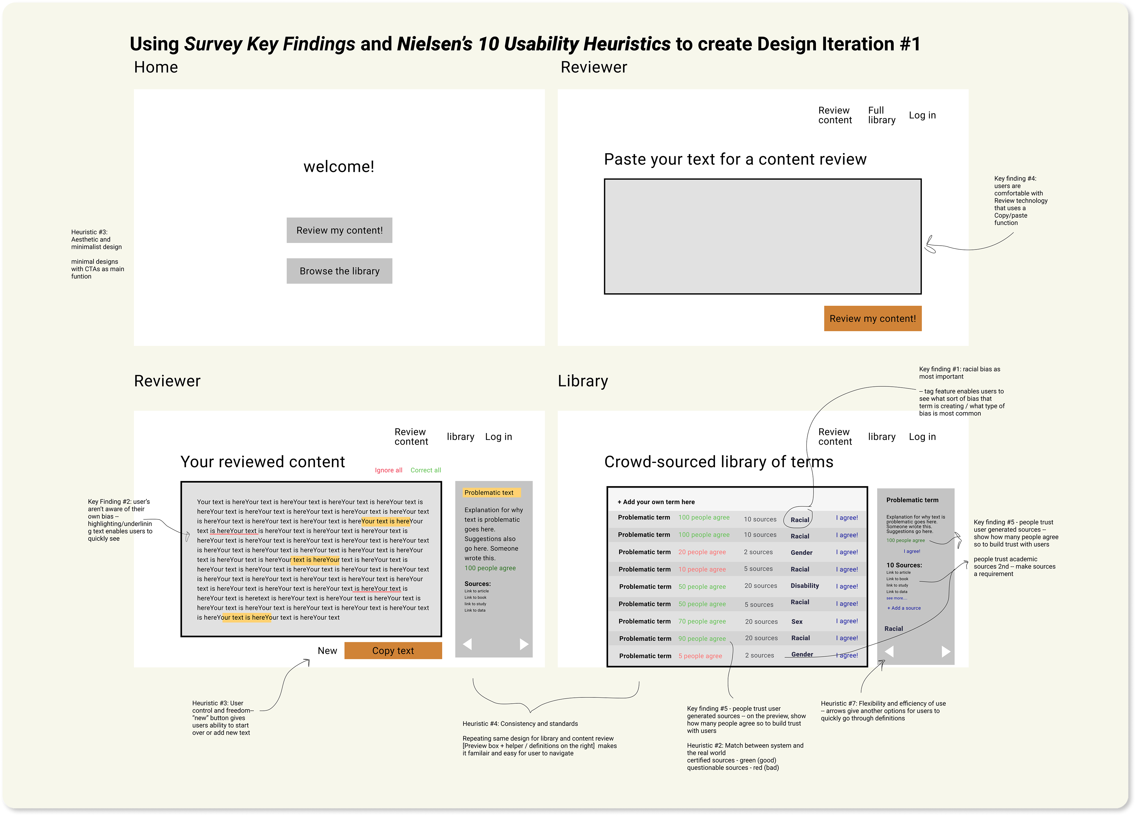
7. Lo-Fi Iteration 2: Research Driven Design
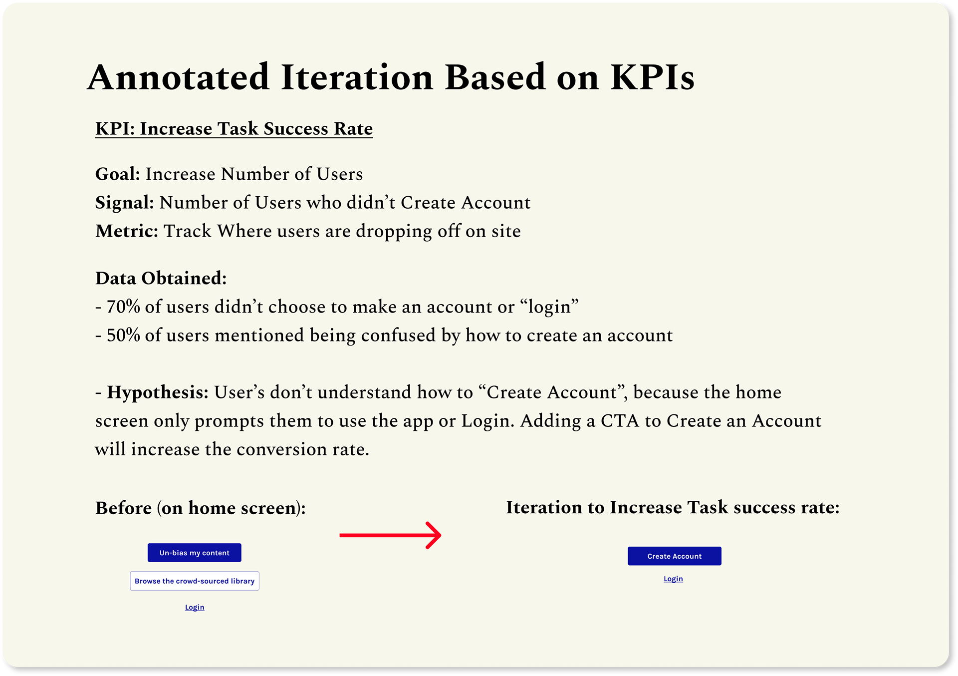
I iterated on my lo-fidelity mockup again considering the user flows and research findings. I also applied Nielsen's 10 Usability Heuristics to the design. I validated my decisions by noting what factors (Heuristics, Key Findings) contributed to my design decisions.
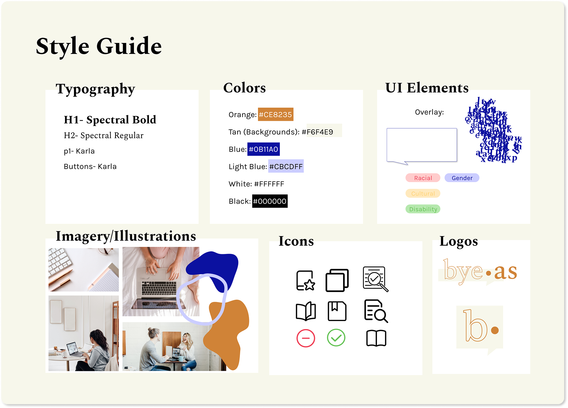
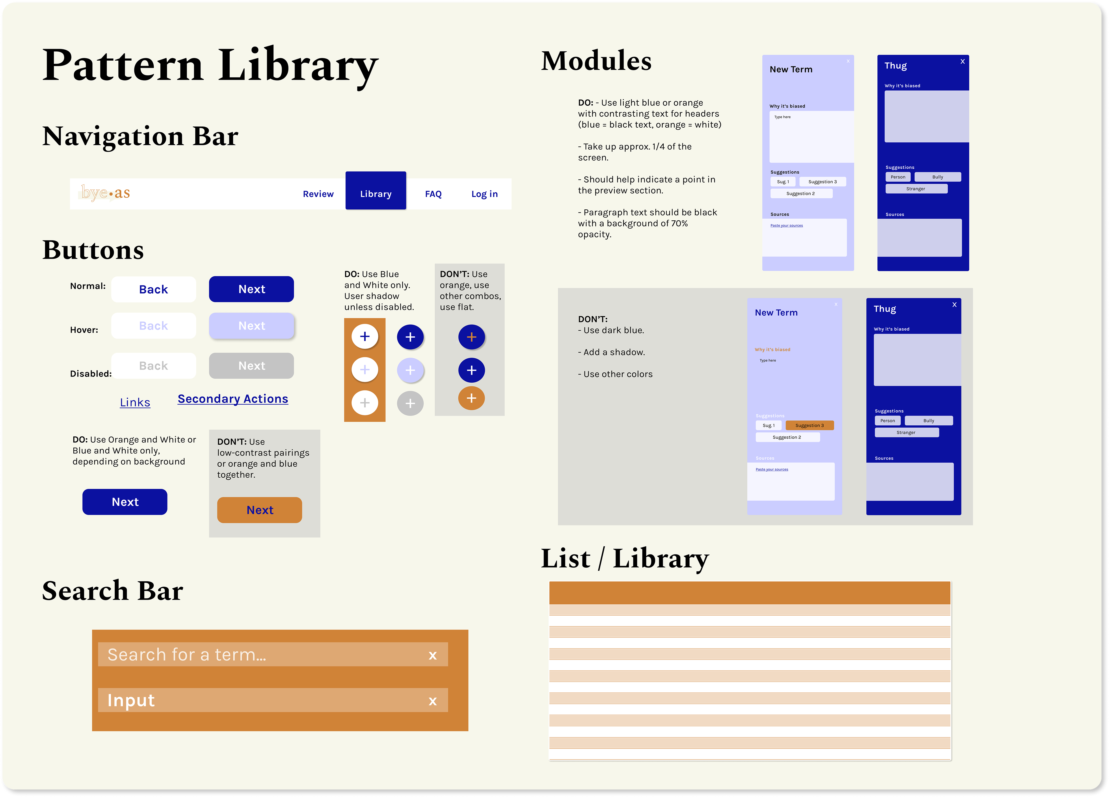
8. Style & Pattern Libraries
I defined the look and feel of the app with a style guide, as well as the rules for different components with a Pattern Library.
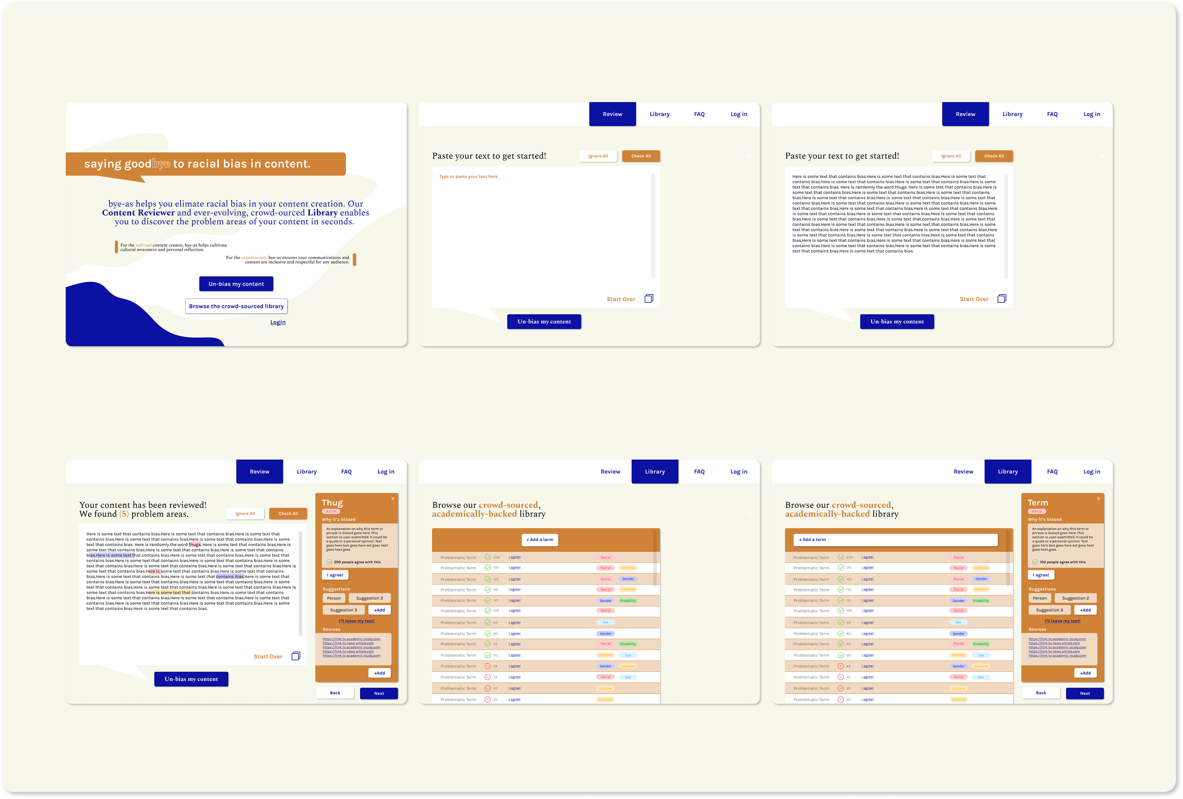
9. High-Fidelity Mockup & Prototyping Iteration 1
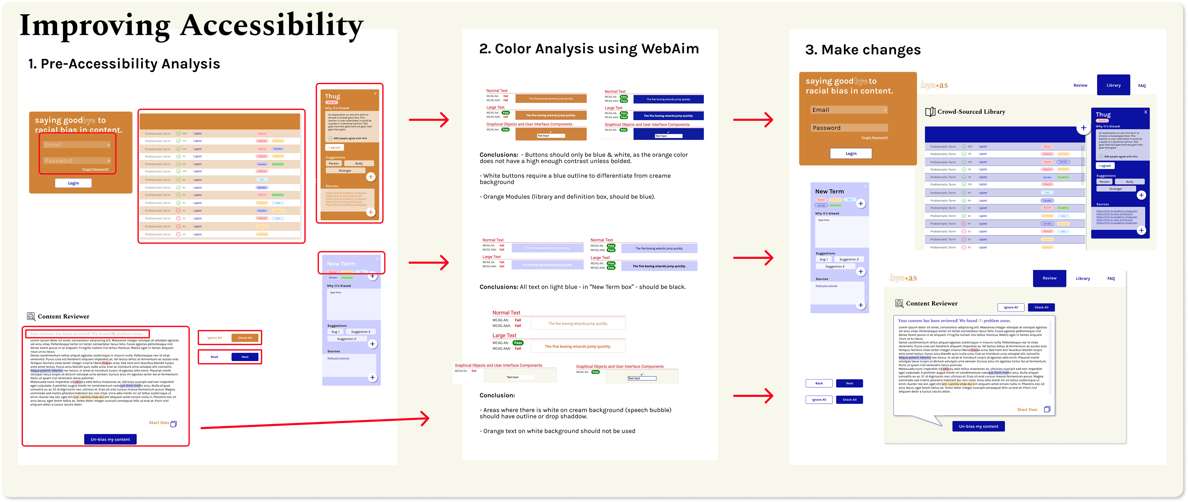
10. Testing for Accessibility
Next, I used WebAim to determine the problem areas in my UI. I then iterated on it (especially color) considering the results.
11. Hi-Fi Iteration 2 & User Testing
12. High-Fi Iteration 3 & Animations
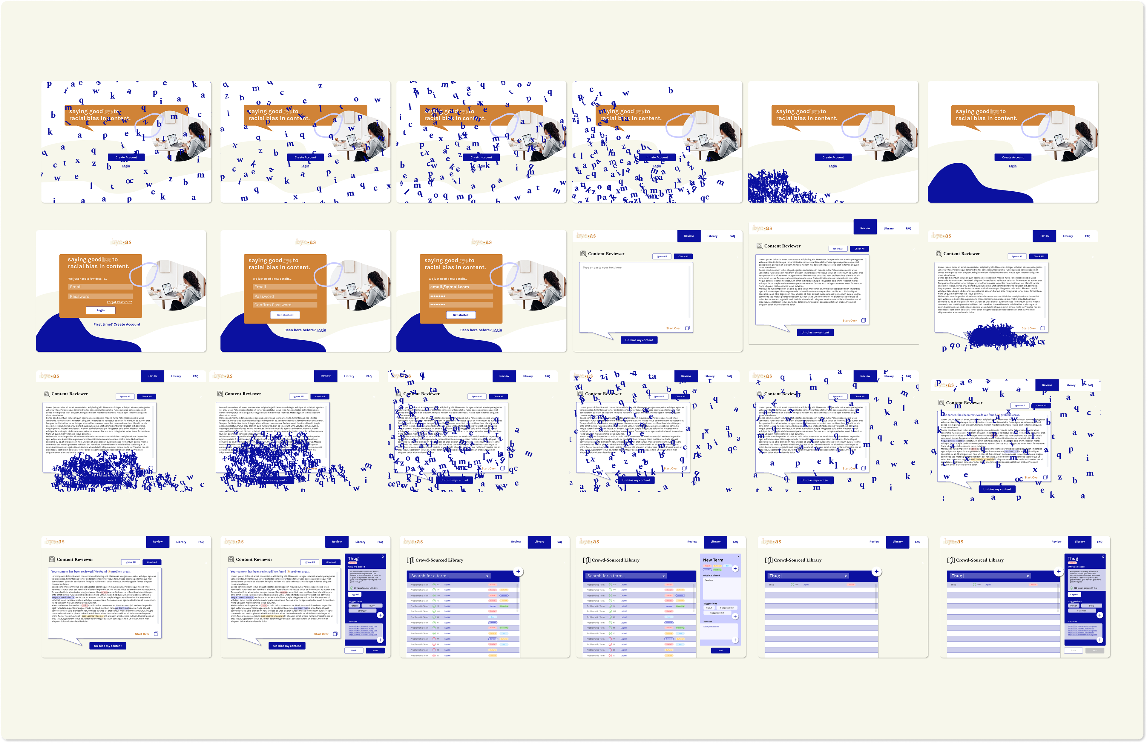
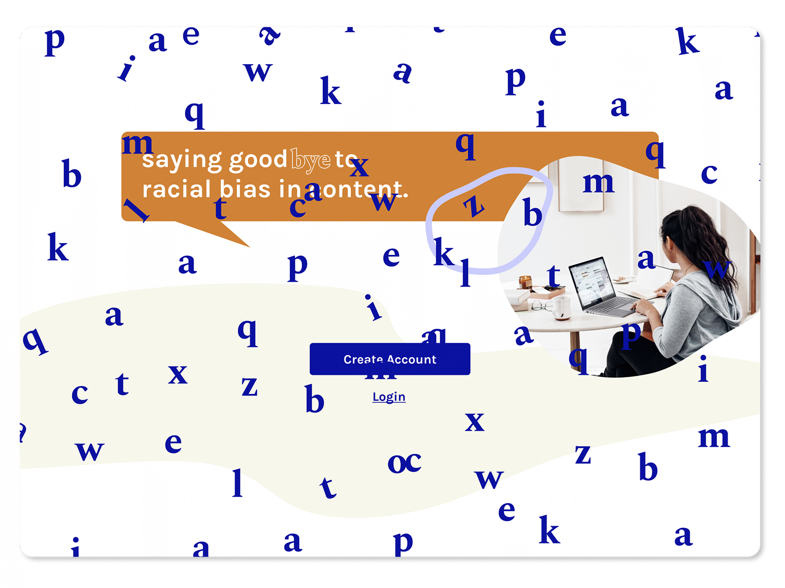
Finally, considering the user testing findings, I iterated on my mockup again. To finish it off, I added other elements, like animations and overlays, to delight the user. View the full, clickable prototype here.
13. Program Graduation & Project Reflection
Overall, I really enjoyed taking the User Experience NanoDegree and Pursuing "Bye-As" as my design project. Udacity did a great job of taking students through the entire product process. Some of the steps I found most valuable were testing for accessibility (10) and conducting user studies (2). I also really like how many tools that Udacity suggested including Miro, Figma, WebAim, Zeplin, Whimsical, Google Surveys, and more.
Tradeoffs/Constraints: Initially, I wanted to make Bye-As a Chrome plug-in. However, after better understanding my users were used to, I decided against it. In the future, I’d like to have this as another form of the app. Furthermore the app lacks the ability to understand Terms in their full context. This is a constraint that could potentially be solved in the future using machine learning.
Impact: If Bye-As gets developed, it would make an impact on the prevalence of bias and racism in content creation, thus also eliminating some of the bias we (the audience) subconsciously digests. My hope is that Bye-As will make creators more aware of the power behind their words. Albeit impossible to track all bias and understand every context, I believe that the app will still significantly contribute to the important conversations of race in language.