

JUKE is an app that creates a collaborative DJ experience. Through it, existing users create a playlist and share it with friends or other party-goers. Much like a real juke box, invited guests can search and add songs to the queue. Guests can then “upvote” or “downvote” songs. Upvotes move the song up in the queue - ensuring no awkward slow jams or party vibe-kills. JUKE takes the pressure off of one host and distributes it to everyone - a playlist for the people, by the people.
The idea and function for JUKE was created by an entrepreneur and friend, Kris Saunders. He came to me to bring it to life with branding, visuals, and a full user experience. Below you will find videos that take you through the main functions of the app, as well as my entire design process. This project was created with Figma.
Disclaimer: I do not own the rights or name for JUKE.
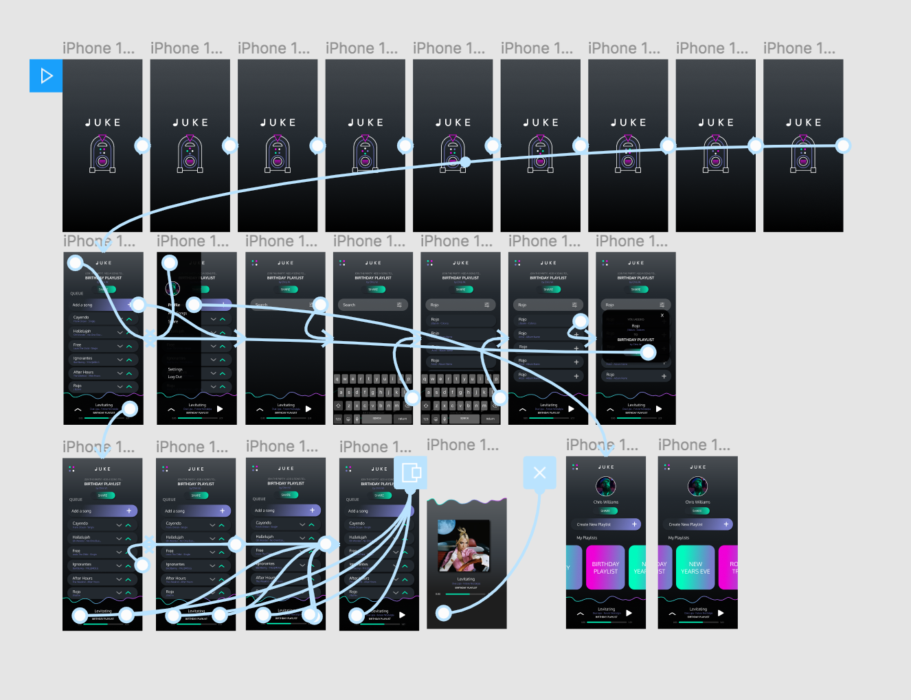
1. Add your song to a collaborative playlist
The prototype to the right demonstrates the flow that a guest goes through to add a song to the playlist.
The jukebox is first reflected through the loading screen visual. Its function is then demonstrated when the user enters the app, sees the queue, and adds their own song.
2. Stream the queue
Music can be paused and played by any user. The moving music waves at the bottom of the screen demonstrate the song being played. See how I developed this visual concept in my process below.
Users can also click on the arrow in the bottom left hand corner to view more details about the song being played.
3. Create a personalized profile
Users do not have to make an account to simply add a song to a playlist. However, only users who make an account have the ability to create a playlist and share it.
When users make an account on JUKE, they will set up a personalized profile. They can then click the menu to navigate to their profile, settings, and more.
Once on their profile, users can create a new playlist and view all previously-created playlists.
_______________________________
THE PROCESS
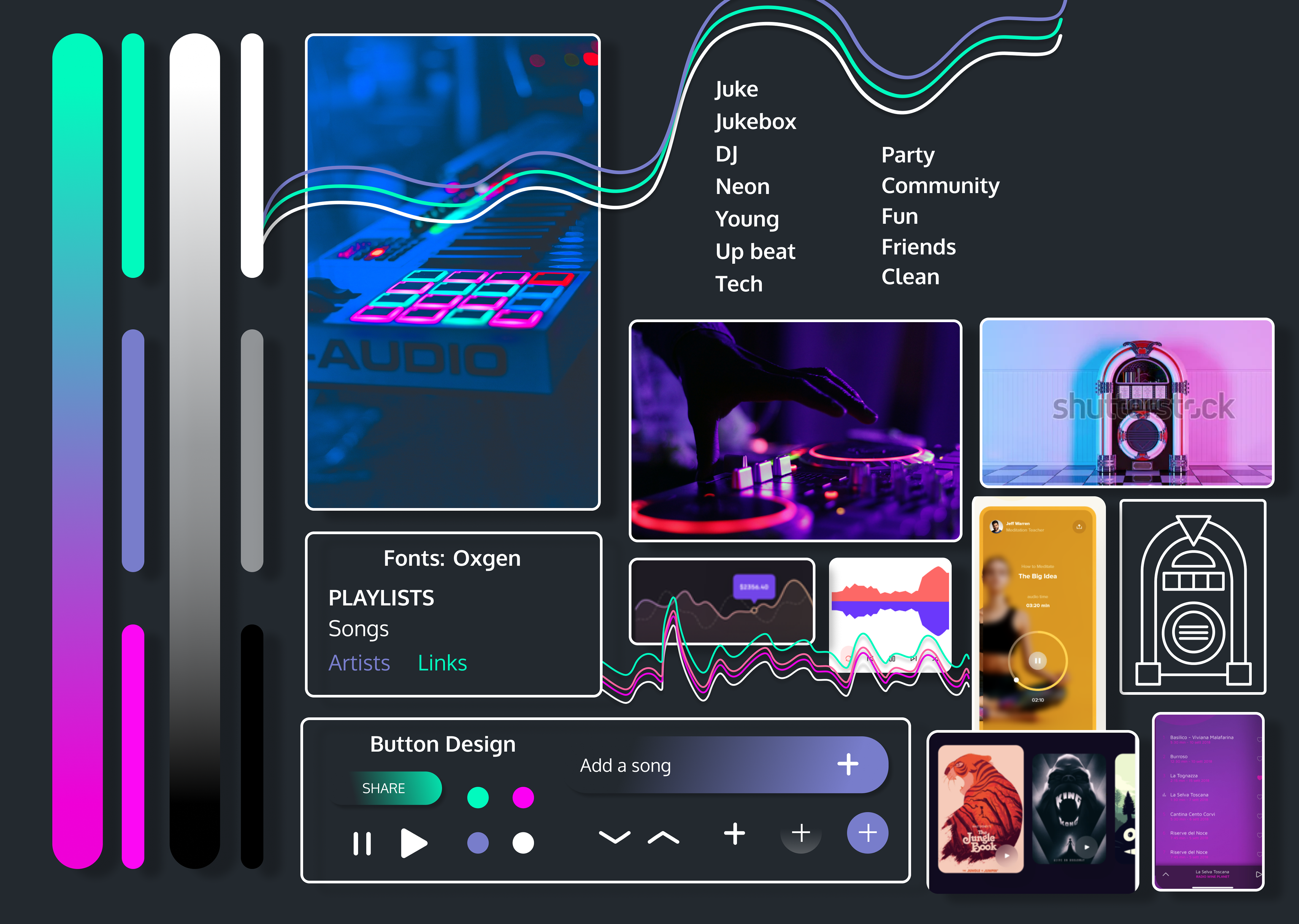
1. Mood board
My first step in designing user experience for JUKE was creating a mood board. Here, I compiled all inspiration for the look and feel of the app.
The primary inspiration for the app was a juke box - from this came the neon color palette, rounded buttons and icons, and more
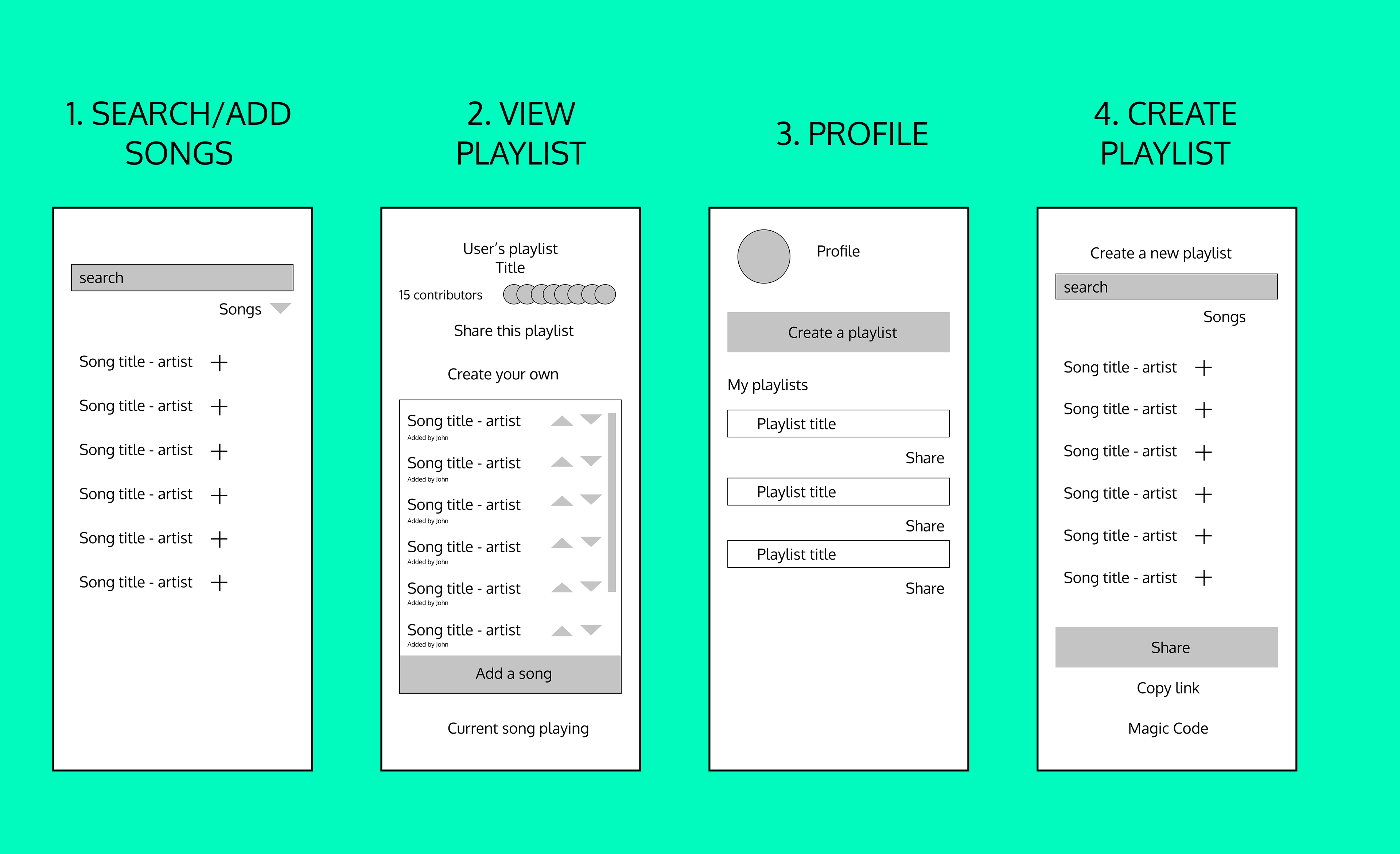
2. Wireframes
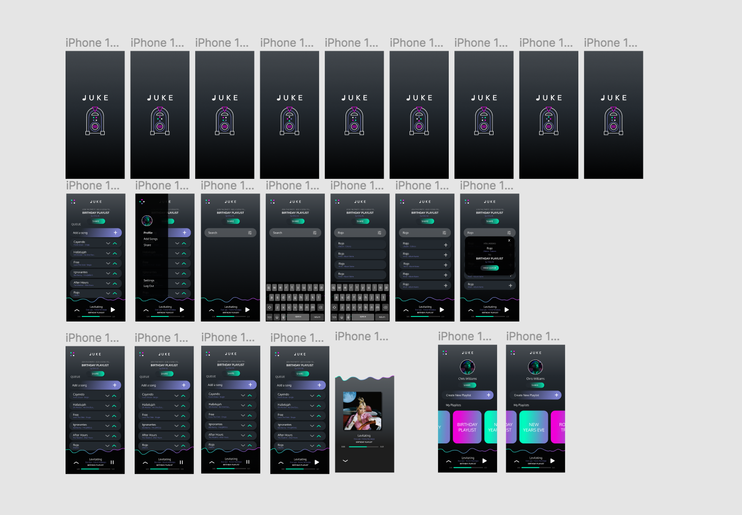
The next step in my process was laying out app functionality. I established the four main user interfaces.
I created these basic mockups to determine the best location for interface elements. To determine these locations, I considered user flow, the intuitive functionality of popular music apps, and the function of a juke box.
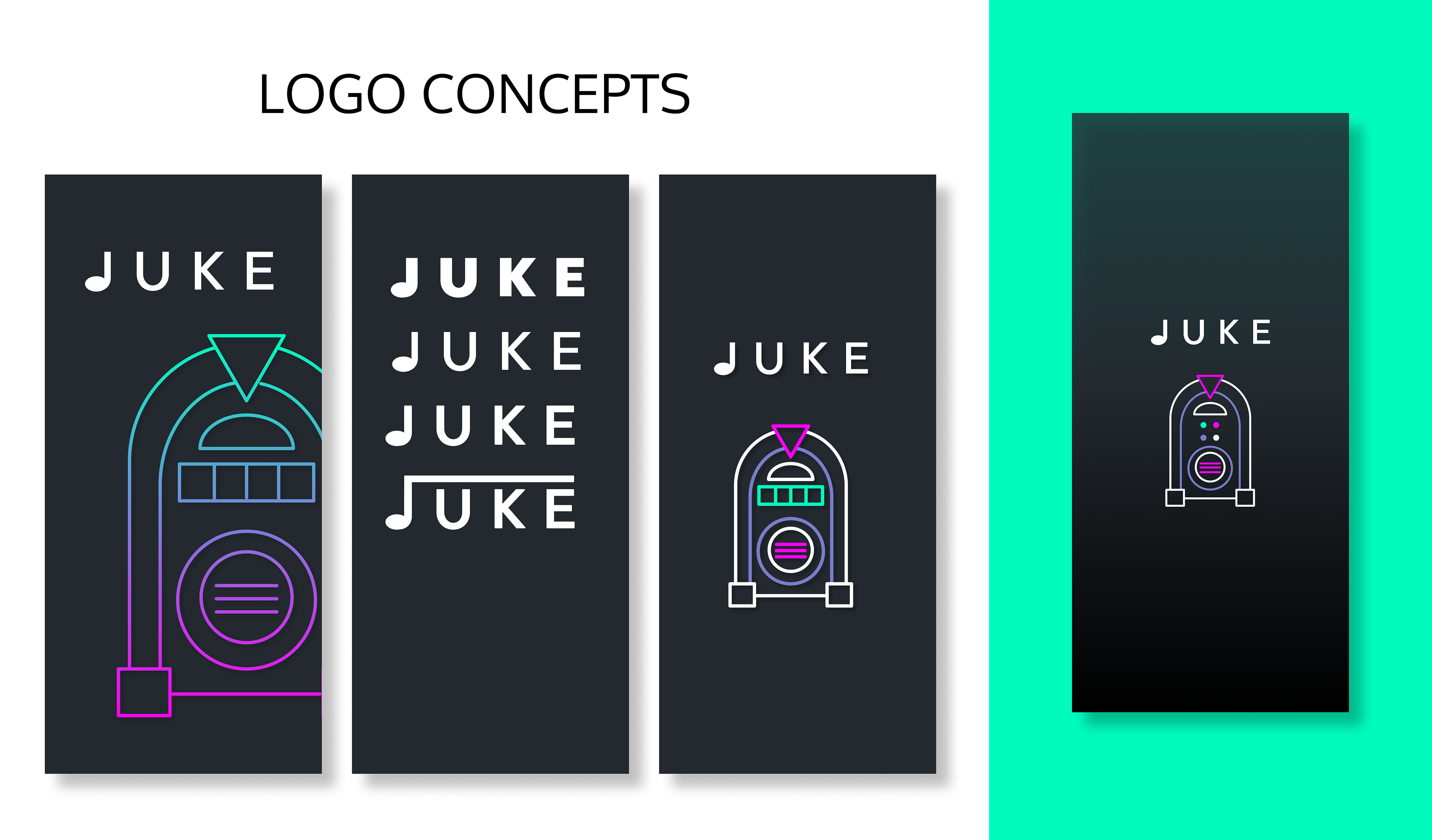
3. Logo & Splash Screen Conception
After settling on fonts and branding in the mood board, I created multiple logo concepts for JUKE. Next, I used the jukebox image to create an animated splash screen.
I also settled on a dark mode experience for the app so that the neon colors would "glow" - much like on a real juke box.
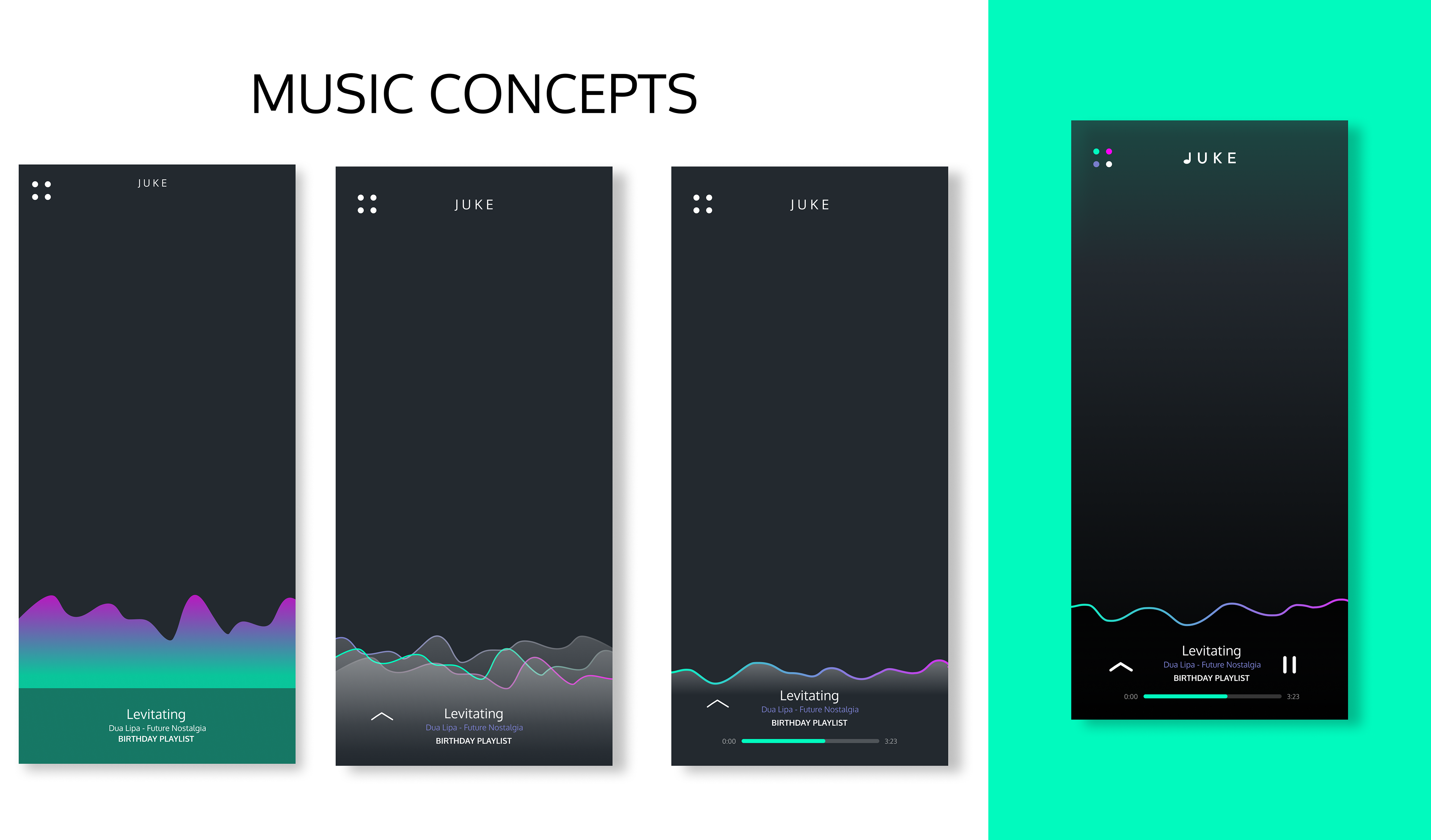
4. Current Song Visual Conception
One of the main visual experiences in JUKE is the moving music wave that displays music playing.
I put this section at the bottom of the screen because it is the most intuitive location for a user to look for song details (as established through apps like Spotify and iTunes).
After iterating on the visual a few times, I decided on the wave with a black shadow. The darker shadow creates subtler visual experience than the light or colored one. It also enables the neon "wave" to pop more.
5. User Interface Design
The next step in Some visual elements to note include the navigation icon composed of out of the four dots from the juke box, the overlay that allows the user to see more details of the song, and the swipe-able playlist library. the process was constructing the full user interface design. It was critical that the UI be simple to follow and appealing, as the app will be inherently be frequented by first-time guests.
6. User Experience Design
Finally, the last step in the process was attaching the prototypes throughout the app.
Again, it was important that the experience was intuitive easy to follow as a first time user.
See the video above to watch the prototype in action.